Midsummer Festival 2013 Brochure & Responsive Website

Role: Graphic Designer / Web Designer / Web Developer

The Midsummer Festival is a celebration of arts and culture that has taken place every summer in Old Lyme for over twenty years. 2013’s event is bigger than ever, with seven sites along Lyme Street from the Village Shoppes all the way up to the Florence Griswold Museum.
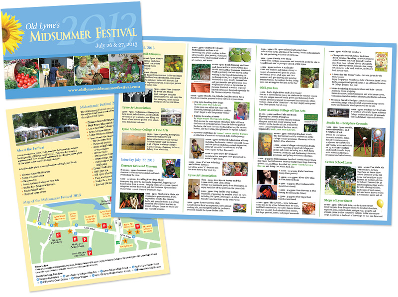
Midsummer Festival brochure

To showcase the festival’s expansion, Brown Bear created a vibrant brochure that lists all the events over two days plus a custom-drawn map of the festival sites, parking areas, and shuttle bus route.
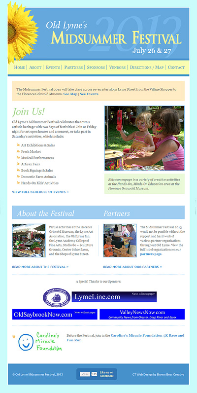
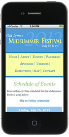
Midsummer Festival websiteMidsummer Festival website on phoneBrown Bear also made improvements to the website, which was originally developed in 2008, to optimize the site across all devices. Now people accessing the site on their smartphones will have an enhanced experience when looking for festival information. The layout is simplified, text is readable, and side scrolling is eliminated when viewing the site on smaller devices.

This type of website is called a responsive website. The layout and other elements change automatically based on the screen width in order to create an optimum viewing experience for all devices.

Launch the Midsummer Festival website >

2013 Discover East Lyme Brochure

Role: Graphic Designer

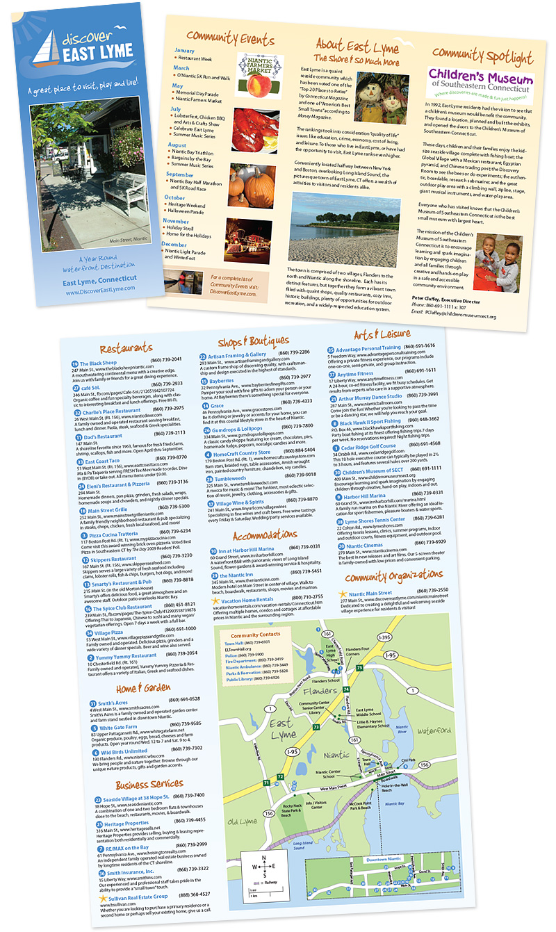
The 2013 Discover East Lyme brochures are out! These brightly colored brochures promote the attractions and businesses in the villages of Niantic and Flanders. The inside folds out to a business directory and custom-drawn map of the area so visitors and residents can easily locate restaurants, shops, art venues, and more!

Look for the new brochures in local storefronts and check out Discover East Lyme online for town news and events.

2013 Discover East Lyme Brochure

Animal Fact Guide Website Redesign

Role: Web Designer / Web Developer / Illustrator

Awards: American Library Association Great Website for Kids

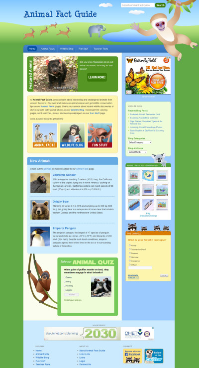
Animal Fact Guide Website RedesignAnimal Fact Guide, an educational website about animals, had expanded its offerings since its launch in 2008. Brown Bear Creative revamped the site by giving it a modern facelift and streamlining user experience.

The new site carries forward the fun feel of the original website, retaining the cute animal illustrations and bright color palette. But the new layout has a more open, less “boxed-in” design. Sleek details like gradients, drop shadows, and rounded corners were coded using the latest technology (HTML5 and CSS3) to enhance the design on modern browsers.

Using an approach called responsive web design, the site gracefully accommodates a wide ranges of screen sizes. This translates to an improved experience on tablets and smart phones.

Several improvements were made to how the site functions on both the front and back end. Brown Bear added a better search feature so visitors can easily locate animal fact articles, blog posts, and printable activity sheets. The site is also completely search-engine optimized, coming up on the first page of Google for keywords like “animal facts.” On the back end, the whole site is powered by WordPress, which simplifies the process of adding articles and blog posts.

The site was recognized by the American Library Association as a Great Web Site for Kids. According to Karen Lemmons, co-chair of the Great Web Sites for Kids committee, “Great Web Sites for Kids are those considered the best web sites for ages birth to 14, outstanding in both content and conception.”

Launch Animal Fact Guide >

Visit Old Lyme Brochure

Role: Graphic Designer

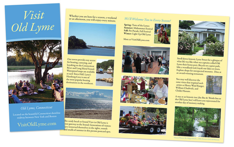
Brown Bear Creative designed bright and welcoming brochures for the Lyme-Old Lyme Chamber of Commerce.  These trifolds showcase information and photos about Old Lyme’s scenic and cultural hotspots.  The inside provides a custom-drawn map and business directory of all the chamber’s members.

Visit Old Lyme brochure

The brochure ties in well with the chamber’s website, Visit Old Lyme, which Brown Bear Creative also designed and developed. Read more about the web design project here >

Attorney Randall A. Ortega Website and Business Cards

Attorney Randall A. Ortega Website DesignRole: Photographer / Web Designer / Web Developer / Graphic Designer

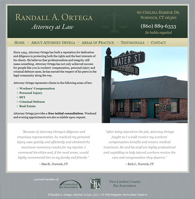
Norwich-based attorney Randall A. Ortega approached Brown Bear Creative for a website to showcase his legal services.

After taking photos of the office and the nearby courthouse, Brown Bear designed an elegant, professional-looking website in a dark green, gold, and grey color palette.

The site puts prospective clients at ease by providing information about each of Attorney Ortega’s areas of practice, his biography and credentials, and testimonials from previous/current clients.

Launch Attorney Ortega’s Website >

Brown Bear also designed new business cards that complement the look of the website and a poster to advertise Attorney Ortega’s services.

Attorney Ortega business card and poster


Difesa Security, LLC Logo and Business Cards

Difesa Security LogoRole: Graphic Designer

When Steve and John, two veterans in the locksmith industry, recently launched their own business called Difesa Security, LLC, they were in need of a fresh look. They wanted to steer clear of old-fashioned skeleton key imagery that dominated the field, so they approached Brown Bear Creative for a bold, contemporary style.

Brown Bear developed a clean logo in a red, white, and black that instantly communicated what their business was about. John and Steve’s business cards continue the sleek look and color palette, creating a unified identity and professional first impression.

Difesa Security Business Cards

Abi and Pete’s Wedding Materials

Role: Illustrator / Graphic Designer / Web Designer / Web Developer

Abi of Brown Bear Creative had some fun creating materials for her summer wedding.  Here are the results:

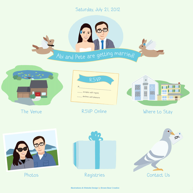
Abi and Pete's wedding website

For the website (AbiandPete.com), Abi created a brightly illustrated website to set the tone for the low-key backyard event.

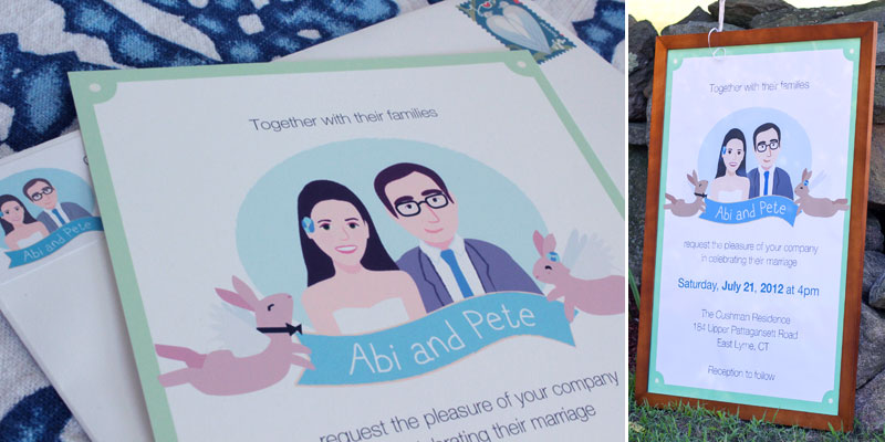
The invitation continued with the laidback tone of the website. Pictured below are the invitation, envelope with return address label, and blown-up poster version of the invitation which welcomed guests to the venue.

wedding invitation and poster

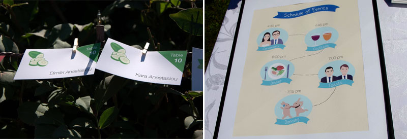
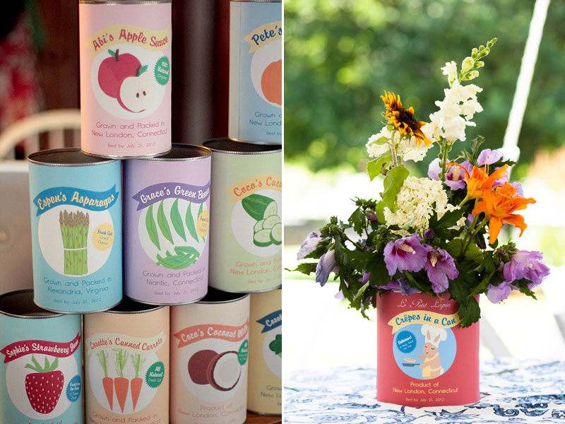
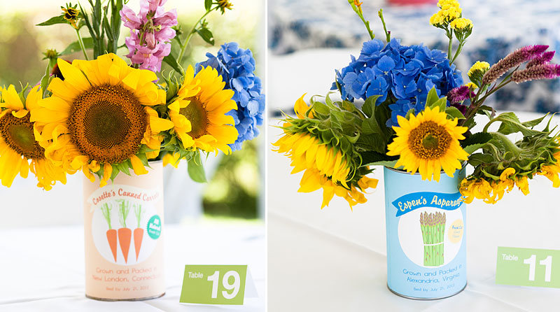
A welcome area at the wedding featured an illustrated schedule of events and colorful escort cards. The color and imagery on the cards corresponded to the flower cans at the tables.

cards-schedule

Can labels

Can labels

For dessert, Abi, Pete, and family made mini pies.  Pictured below are the pies with a sign and flavor labels.

Mini pies with sign/labels


Visit Old Lyme: Lyme-Old Lyme Chamber of Commerce Site

Lyme-Old Lyme Chamber of Commerce WebsiteRole: Web Designer / Web Developer

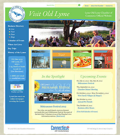
The Lyme-Old Lyme Chamber of Commerce wanted to strengthen their web presence with a new website.  Brown Bear designed and developed a welcoming, yet comprehensive site that appeals to residents, tourists, and businesses alike.

Drawing upon the town’s artistic heritage, Brown Bear used textures and graphics that hinted at fine art paper and brushstrokes. The vivid blues, greens, and yellows in the site’s color palette coupled with a slideshow of various town festivities help create an overall feeling of vibrancy on the homepage.

Four highlighted categories on the homepage draw you into the heart of the site: the Chamber’s business directory.  Divided into Live, Visit, Dine, and Shop, the business listings include each business’s contact details, an image/logo,  a description, a map of its location, and social media links when available.  The directory can be further filtered by subcategory or searched by keyword.

The site also includes a calendar of Chamber and town events; information, forms, and news relating to the Chamber; and a description/history of the town.

Launch Visit Old Lyme website »

Brown Bear Creative also designed promotional brochures for the Lyme-Old Lyme Chamber of Commerce. Read about the brochure design project here >

CT Pet Guide Website Redesign

CT Pet Guide Website RedsignRole: Graphic Designer / Web Designer / Web Developer

CT Pet Guide is a website that features information about pet-related businesses, animal rescues, and adoptable pets throughout Connecticut. It helps Connecticut residents shop locally and find nearby animal rescues.

It was first launched in 2006 with a password-protected members area where people could update their shelter or featured business pages themselves.  Animal rescues could also post details and photos of their available animals.  However, this setup was prone to user-error and outdated information.

Brown Bear Creative revamped the website by updating the logo and design as well as streamlining the user experience.

Instead of having shelter volunteers post their animals directly on CT Pet Guide, Brown Bear used data from Petfinder’s vast database of homeless pets. This eliminated the need for rescue workers to duplicate their posts and ensured the information stayed current and comprehensive.

Similar to the previous design, Brown Bear randomly showcased a Connecticut animal rescue on the site’s homepage.  To make the organizations easier to find, Brown Bear added a function to narrow down the rescues by the type of animal they take in.

Brown Bear also improved the business directory. Listings can by filtered by category as well as by keyword.  Each entry can display contact information, social media links, a photo/logo, a description, and a map of their location.  Submissions to the directory are free.

Launch CT Pet Guide website »

Melissa’s Bridal Shower Invitations, Thank You Cards, and Recipe Cards

Role: Graphic Designer / Illustrator

For Melissa’s spring bridal shower, Brown Bear created invitations, thank you cards, and recipe cards with a garden party flavor.  The cards all featured a tranquil illustration of daisies set amidst a palette of blue, gold, and white.

Sister-of-the-bride Michelle embellished the invitation design by mounting the front and inside panels on peacock blue cards.

Bridal shower invitations, thank you cards, and recipe cards