Northeastern Connecticut Council of Governments (NECCOG) Logo and Responsive Website

Role: Graphic Designer / Web Designer / Web Developer

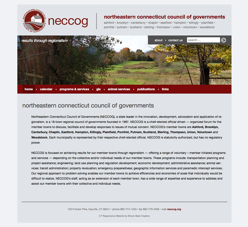
The Northeastern Connecticut Council of Governments (NECCOG) provides a wide array of services for its sixteen member towns.  NECCOG contracted with Brown Bear Creative to design and develop an all-encompassing website and a new logo.

NECCOG’s new logo is simple and sleek, using a modern color palette of grays and burgundies. The graphic alludes to the type of towns the council serves without being completely literal and overly cluttered.
neccoglogo_final

NECCOG’s new website is powered by WordPress, an open-source content management system. In this way, staff can easily update the site to provide the latest information and photos using an intuitive, browser-based admin panel.

Brown Bear designed and developed the website theme to be responsive, which means the layout adapts gracefully depending on the screen size. This allows the information to be easily readable and accessible on desktops, laptops, tablets, and smartphones alike.

According to John Filchak, NECCOG Executive Director, “This web site will enable NECCOG to better communicate with the public in northeastern Connecticut – allowing them more informed opportunities to comment on our activities and the future of the region.”

NECCOG website

Brown Bear has also designed and developed a standalone site and logo for NECCOG’s bus system, the Northeastern Connecticut Transit District (NECTD), which provides schedules, maps, fare information, and more.

Launch the Northeastern Connecticut Council of Governments Website »

Scranton Library Responsive WordPress Site

Role: Web Designer / Web Developer

Awards: 2015 Connecticut Library Association’s Publicity Award for Electronic Media/Website

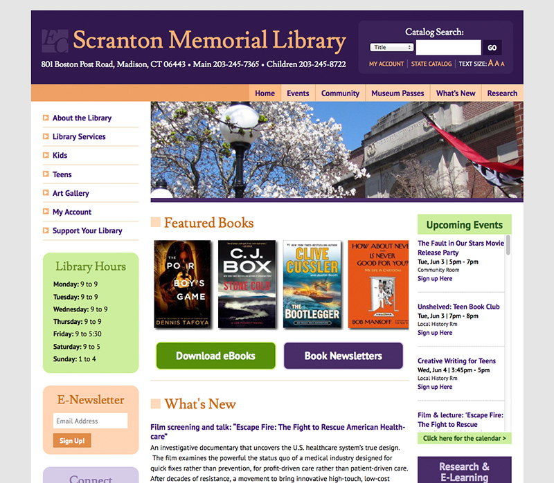
E.C. Scranton Memorial Library in Madison, CT needed a complete revamp of their website. Brown Bear Creative designed and developed a new responsive website powered by WordPress for them.

Responsive WordPress Website for Scranton Library

The color scheme of the new site more closely matches the palette inside the library, which include eggplant, mango, and lime hues. The Kids and Teens sections have individualized templates to help them stand out from the rest of the site.   The landing pages for these sections along with the homepage of the website highlight frequently-used features such as the catalog search, upcoming events, new books, eBooks, and online databases.

Because the website is powered by WordPress, various members of staff can update their own department pages and news items. They do not need special software, and they can log in from anywhere into the backend admin area. This streamlines the process of keeping the website up to date.

The website is responsive which means the layout adapts to various screen sizes like desktop, tablet, or mobile.  This makes the site readable and accessible across all devices.

Launch E.C. Scranton Memorial Library website >

My House Rabbit Responsive Website Reboot

Role: Web Designer / Web Developer

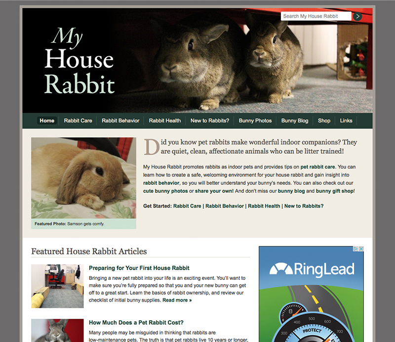
My House Rabbit, an educational website providing tips on pet rabbit care and behavior, got an under-the-hood makeover.  While the look of the desktop version of the site looks fairly similar to the previous version, the site was completely redeveloped by Brown Bear Creative.

My House Rabbit Website Design

The new site runs on the WordPress platform. This means all the content is maintained via an easy-to-use online admin panel.  Adding new articles and photos is a quick, streamlined process.  Because all the content is housed in a database, a new search function at the top of every page allows visitors to access any information in the site in an efficient manner.

In addition, the new site has a responsive design. A responsive design allows the website’s layout to adjust to different screen sizes. In this way, visitors using smart phones or tablets see a version of the site optimized for that specific size. Everything is still accessible to those visitors, but they don’t have to zoom in or do any side scrolling to access the information. The text is already readable when they load the site.

Launch My House Rabbit website >

Robert L. Edmonstone, DDS Responsive Website

Role: Web Designer / Web Developer / Illustrator

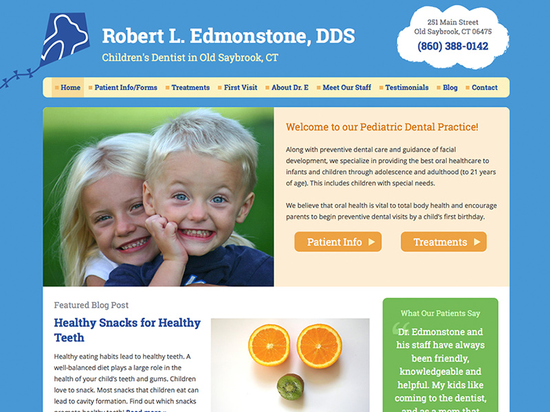
Brown Bear Creative designed and developed a bright, welcoming website for Dr. Robert L. Edmonstone, a children’s dentist in Old Saybrook.

Edmonstone Dental Responsive Website

The colorful site reflects the friendly atmosphere of the office. Parents of new and existing patients can easily navigate the site and download forms.  The site is responsive, which means the layout adapts to smaller screen sizes such as tablets and smartphones. In this way, the site is easy to read across all devices.

Powered by WordPress, the site can be easily updated by Dr. Edmonstone and his staff.  The site includes a blog, which Dr. Edmonstone can use to share oral hygiene tips and news updates.

Launch Robert L. Edmonstone, DDS website >

Attorney Lorraine D. Eckert, P.C. Responsive Website

Role: Web Designer / Web Developer

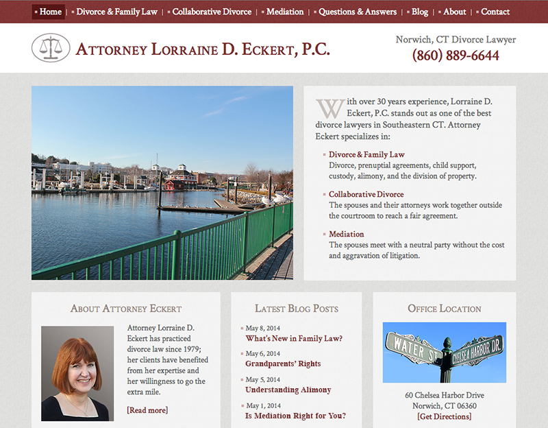
Web design and development for Lorraine D. Eckert

Norwich-based divorce lawyer, Lorraine D. Eckert, was in need of a platform to highlight her services and share her expertise of family law.

Brown Bear Creative designed and developed a WordPress-powered, responsive website for Attorney Eckert.  The site’s layout adjusts so that it is easily readable across mobile devices, tablets, and desktops.

Because the site is powered by WordPress, the content is easily editable via a password-protected admin area.  Attorney Eckert can update the pages of the site herself, and she can also create blog posts.

Launch Attorney Lorraine D. Eckert, P.C.’s website >

Ledyard Public Libraries Responsive Website

Role: Web Designer / Web Developer

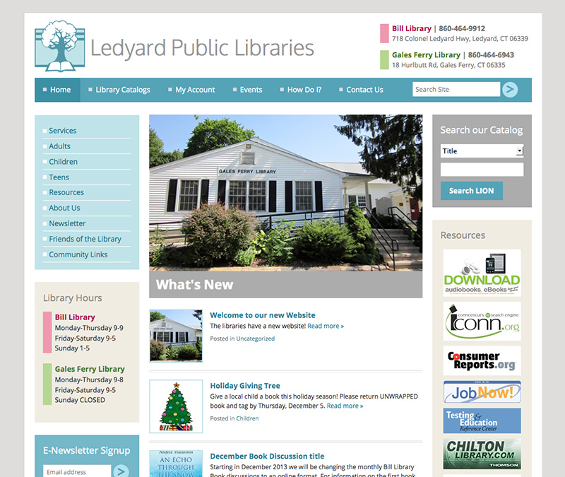
Ledyard Public Libraries website

Ledyard Public Libraries was in need of a website that would showcase all the offerings of the Bill Library and the Gales Ferry Library.

Ledyard Public Libraries mobileBrown Bear Creative designed and developed a modern, responsive website powered by WordPress.  The design is very clean, using a palette of teals, tans, and greys. Each library is given a distinguishing, signature color (cranberry for Bill Library and green for Galesferry). Visitors to the site can easily search the LION catalog, access a multitude of databases, and learn about upcoming events at the libraries.
The layout adapts gracefully to smaller screen sizes, going down to a two-column design for tablets and a one-column design for mobile devices.

The librarians manage the content of the website via WordPress’s admin panel.  They can post news, hold online book discussions, and add or edit webpages.

Launch Ledyard Public Libraries website >


Animal Fact Guide Website Redesign

Role: Web Designer / Web Developer / Illustrator

Awards: American Library Association Great Website for Kids

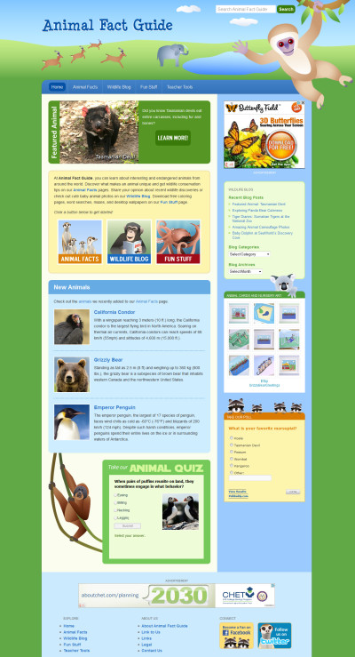
Animal Fact Guide Website RedesignAnimal Fact Guide, an educational website about animals, had expanded its offerings since its launch in 2008. Brown Bear Creative revamped the site by giving it a modern facelift and streamlining user experience.

The new site carries forward the fun feel of the original website, retaining the cute animal illustrations and bright color palette. But the new layout has a more open, less “boxed-in” design. Sleek details like gradients, drop shadows, and rounded corners were coded using the latest technology (HTML5 and CSS3) to enhance the design on modern browsers.

Using an approach called responsive web design, the site gracefully accommodates a wide ranges of screen sizes. This translates to an improved experience on tablets and smart phones.

Several improvements were made to how the site functions on both the front and back end. Brown Bear added a better search feature so visitors can easily locate animal fact articles, blog posts, and printable activity sheets. The site is also completely search-engine optimized, coming up on the first page of Google for keywords like “animal facts.” On the back end, the whole site is powered by WordPress, which simplifies the process of adding articles and blog posts.

The site was recognized by the American Library Association as a Great Web Site for Kids. According to Karen Lemmons, co-chair of the Great Web Sites for Kids committee, “Great Web Sites for Kids are those considered the best web sites for ages birth to 14, outstanding in both content and conception.”

Launch Animal Fact Guide >

Visit Old Lyme: Lyme-Old Lyme Chamber of Commerce Site

Lyme-Old Lyme Chamber of Commerce WebsiteRole: Web Designer / Web Developer

The Lyme-Old Lyme Chamber of Commerce wanted to strengthen their web presence with a new website.  Brown Bear designed and developed a welcoming, yet comprehensive site that appeals to residents, tourists, and businesses alike.

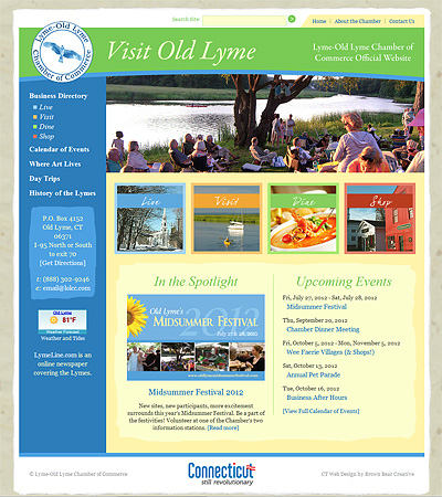
Drawing upon the town’s artistic heritage, Brown Bear used textures and graphics that hinted at fine art paper and brushstrokes. The vivid blues, greens, and yellows in the site’s color palette coupled with a slideshow of various town festivities help create an overall feeling of vibrancy on the homepage.

Four highlighted categories on the homepage draw you into the heart of the site: the Chamber’s business directory.  Divided into Live, Visit, Dine, and Shop, the business listings include each business’s contact details, an image/logo,  a description, a map of its location, and social media links when available.  The directory can be further filtered by subcategory or searched by keyword.

The site also includes a calendar of Chamber and town events; information, forms, and news relating to the Chamber; and a description/history of the town.

Launch Visit Old Lyme website »

Brown Bear Creative also designed promotional brochures for the Lyme-Old Lyme Chamber of Commerce. Read about the brochure design project here >

CT Pet Guide Website Redesign

CT Pet Guide Website RedsignRole: Graphic Designer / Web Designer / Web Developer

CT Pet Guide is a website that features information about pet-related businesses, animal rescues, and adoptable pets throughout Connecticut. It helps Connecticut residents shop locally and find nearby animal rescues.

It was first launched in 2006 with a password-protected members area where people could update their shelter or featured business pages themselves.  Animal rescues could also post details and photos of their available animals.  However, this setup was prone to user-error and outdated information.

Brown Bear Creative revamped the website by updating the logo and design as well as streamlining the user experience.

Instead of having shelter volunteers post their animals directly on CT Pet Guide, Brown Bear used data from Petfinder’s vast database of homeless pets. This eliminated the need for rescue workers to duplicate their posts and ensured the information stayed current and comprehensive.

Similar to the previous design, Brown Bear randomly showcased a Connecticut animal rescue on the site’s homepage.  To make the organizations easier to find, Brown Bear added a function to narrow down the rescues by the type of animal they take in.

Brown Bear also improved the business directory. Listings can by filtered by category as well as by keyword.  Each entry can display contact information, social media links, a photo/logo, a description, and a map of their location.  Submissions to the directory are free.

Launch CT Pet Guide website »

The Law Office of Peter Goselin Logo and Website

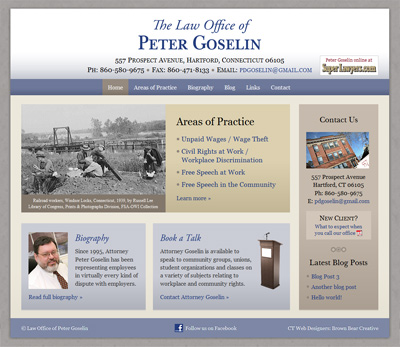
The Law Office of Peter Goselin Website

Role: Graphic Designer / Web Designer / Web Developer

When Peter Goselin, a Hartford-based attorney specializing in employment law, decided to start a solo practice, he contacted Brown Bear Creative for a logo and website. He wanted his identity materials to reflect the values and nature of his practice: professional, yet down-to-earth.

Brown Bear developed a simple, yet elegant logo, and a clean, straight-forward website to match. Drawing upon the focus of Attorney Goselin’s law practice – defending civil rights and helping workers collect unpaid wages – a historical photo of Connecticut railroad workers captures visitors’ attention on the homepage. His four main areas of employment law practice, his contact information, and his biography are also highlighted, quickly leading visitors to the information they need.


Launch the Law Office of Peter Goselin website »